Elizabether Friedlander – designing against the odds
By lovely chance (I was just dropping off some more tea towels and pouches at the shop), Alice and I got to go along to the private view of the new show at Ditchling Museum of Art and Craft – Elizabeth Friedlander: Typographer, Calligrapher, Designer.
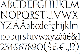
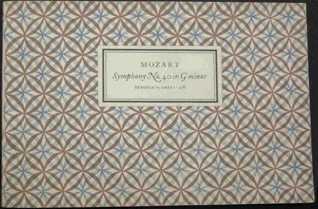
Elizabeth was a design prodigy, commissioned to design her own typeface (‘Elizabeth) straight out of college in 1930’s Germany. The typeface was to be called ‘Friedlander’ but due to the prevailing anti-semitism of the time, it was changed to the less Jewish sounding Elizabeth.
On the brink of commercial success as a typographer and illustrator in Germany, Elizabeth instead had to flee for her life, first to Italy and then to England, where she found work as a domestic servant.
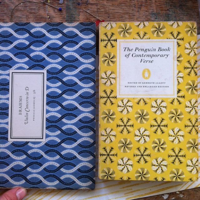
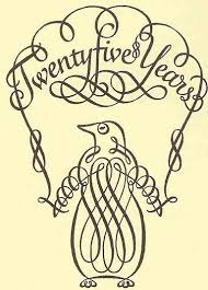
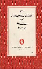
Her skills and talent proceeded her, however and she found work designing advertising logos for The Times, Shell and beer mats! She also designed the lovely twirly Penguin logo. All her work is instantly familiar and recognisable and I found that I had several covers she designed for Penguin in the 1960’s, which I was already rather fond of. Now of course, they are firm favourites and have been rescued from our dusty poetry book shelves. You’ve probably got a copy of ‘Contemporary Verse’ or even the ‘Penguin Book of Italian Verse’ tucked away somewhere… I have to admit that rather superficially, mine was bought for the cover not the contents.
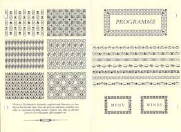
Friedlander’s work is resolutely un-English, it’s not trying to be naive, folky or simple in that Bawden-esque way. Rather, it is modern, decorative and much more European; in it’s execution Friedlander is painstaking, making lovely delicate marks that are often minute in scale (The Museum offers magnifying glasses) and always perfectly harmonius.
With this kind of talent and attention to detail, Friedlander always found work especially through the patronage of her mentor Francis Meynall, but most incredibly she worked throughout the war for the Government’s black propaganda unit, producing items such as forged Wehrmacht & Nazi rubber stamps and ration books.
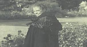
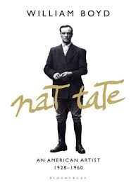
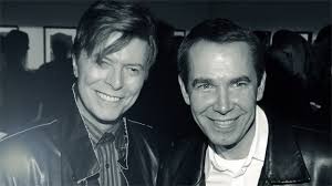
Apart from one blurry photo of Friedlander, we were unable to find any other images of her – what she wore, the letters she wrote or diaries she kept (there were a few Christmas cards)… all the things that make a subject come to life. This got us fantisizing that maybe she was an invented person or maybe a cover for someone, a bit like how William Boyd and David Bowie invented art legend Nat Tate back in the 80’s.
Real or not, thanks to Friedlander, I am inspired me to be more careful, neater, diligent and professional all round in my work – in fact I’m just off to tidy my studio now…
Do go and see the exhibition if you get the chance (it’s on until the end of April). Friedlander deserves to be much more widely known for the beautiful discipline, rhythm and rigour of her work as well as for her incredible tenacity as a designer in the face of terrible odds.
Thanks to Jen at Ditchling for the invite, to David for looking after the boys & Alice for telling me about Nat Tate.
